Project Duration
October 2022 - December 2023
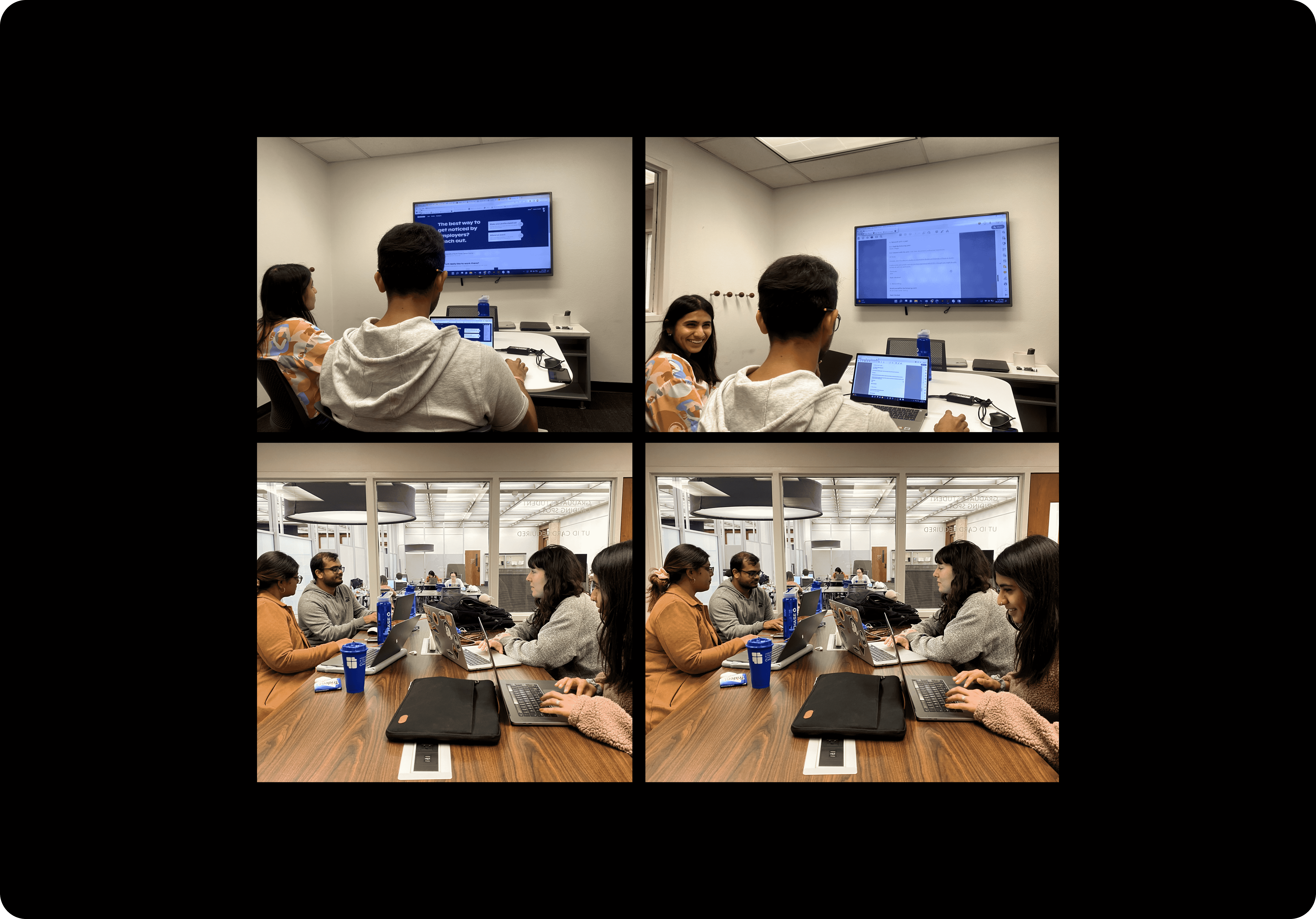
Brainstorming an Idea!
To begin, we first had to decide what website or app we wanted to focus our research on. Each member of our group chose a website or app of interest to present to the rest of the group so that we could click through the website and decide which one we were most interested in conducting our user research study on. We looked for sites that were relevant to our lives as students as well as sites with obvious UI and UX issues that would be conducive to a strong case study. We chose to select our topic this way, so we could decide as a group and have a topic we were all passionate about and excited about.